Tuesday, October 21, 2008

Learning

I have quite enjoyed communications this semester, however, am slightly disappointed that we did not get to try all workshops, even though this would not be possible. 

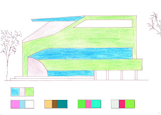
In a way, I struggled to relate each workshop to each other, particularly due to the order I did things. I found that things I learnt in colour, I could have used in the Drawing workshop, so instead, I reflected on what I had done and what I could have changed. One of the biggest things I learnt was to be organised in the way you put things together, whether it be composition or navigation. This needs much thought and consideration. I found this is relevant to each of the workshops I participated in. Further understanding the importance of composition in the Drawing Workshop allowed me to carefully compose positioning and framing of drawings in the Fluid Thoughts workshop. Spatial ideas from the Atlas of Colour were further developed and refined in the Fluid Thoughts workshop.

These ideas I can most definitely refine and continue to use for the rest of my degree and worklife. Spatiality is important for me in the way I perceive structures and good composition is necessary to present this. 

Overall, it was quite enjoyable.

Workshop 3 - Fluid Thoughts to Action


For the third workshop, we were required to draw two A4 drawings a day, one at morning, the other at night. This added up to 42 drawings in total, half of them interior spaces, the other half exterior. Doing this daily encouraged the fact that process is extremely important and ideas can be developed through repetition. I attempted a number of styles of drawing using conte and willow charcoal. These included the use of lines, tone, smudging, squiggles and using the charcoal on edge. Some pictures focused on tone only, others considered form as well. 

As well as these drawings, we produced A2 drawings during class time and others at home. During the first week, we took a trip to the Opera House and did observation drawing. First off, we had to produce one drawing, move to another area and draw on top of this. The next was just one drawing, again in another area. 

The third A2 drawing is of the landscape, looking out the windows of the Red centre on level 6. We then had to choose an element and draw a large scale version of this on top of the landscape. I chose to draw the lights on the pole next to the oval, as their form especially caught my eye. 

Next is a still life drawing where few objects were placed in front of us and we began to draw them. After a little while, the objects would be moved slightly. Ours were moved five times. To articulate this on the drawing, I used methods of transparency, interlocking and tried to track the movement of the objects as well as their spatial qualities. The constant movement was very interesting and captivating to understand how to present the changes.

Lastly, the group collaborative exercise, where a colleague would describe an architectural space, and I would draw it. This was interesting as we had to develop our idea and draw spatially without observing a space. 


Tuesday, September 16, 2008

WORKSHOP TWO-ATLAS OF COLOUR

Achromatic tonal keys: From top, left to right, high major, high minor, intermediate major (high), intermediate major (low), intermediate minor, low major, low minor.

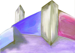
My interpretation of the class window:

This map, based on Barragan's face is labelled with places relating to Barragan's life/projects/concepts. For example, "the Sea of Silence" refers to Barragan's idea of the beauty of silence. 


Tuesday, August 19, 2008

Final Submission - Drawing Workshop

A1 Page 1 - 3D Drawings
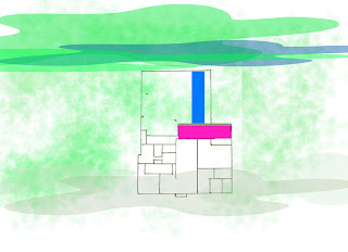
North at top of page.

DETAILS


Having been to the Rose Seidler House, I was impressed by two main points. 

Firstly, the open space is accentuated by many windows allowing a large amount of natural light into the building. It is divided into two main areas, the public/living domain (which includes the kitchen/dining area and living room) and the private domain (the bathroom and bedrooms). The deck and 'playroom' act as a path and mediator between the two. This pathway can even be adapted to suit a situation, with a full height curtain able to divide the playroom and a doorway joining the deck to the master bedroom. 

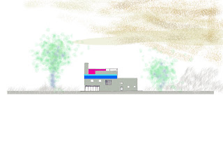
Secondly I focused on colour. Harry Seidler said "People who lead complicated lives (and most of us seem to) cannot be comfortable in a highly colourful interior." This is interesting as the Seidler House contains only three colours, red, yellow and blue. These primary colours are fundamental elements that form a basis for new things, and are used only in curtains, doors, furniture and the mural on the deck. 

I tried to develop my understanding of these two points through my drawings, especially in my perspective drawing.

Class Exercises - Drawing Workshop 1

Perspective Exercise

Rose Seidler Perspective Exercise, placing the house amongst University buildings.

Week One, Teacup Measured Drawing Exercise